
When designing artwork for laser cutting, you need to bear in mind that the lines you create will be followed by a cutting machine. Here are some top tips to help you avoid the common pitfalls and get your design right first time.
Artwork formats
Laser cutting requires artwork in vector format (ai, eps, svg, dxf, pdf). These formats allow individual components of the artwork to be picked out and colour coded for cut through, vector engraving (kiss cut) or raster engraving. But most importantly, the laser follows the vector lines for cutting as though it’s doing a line drawing.
Quick hits
- All lines should be hairline thickness only. If you have thicker lines, the laser will want to cut around them.
- You don’t need to fill areas with colour if you want them cut out. Simply draw the outline of the shape and the laser will follow the lines and cut the shape out.
- Make sure that a continuous line surrounds your shapes. This ensures that corners are cut cleanly as well as the straights and curves. If there are gaps in the outlines, pieces won’t fall out easily.
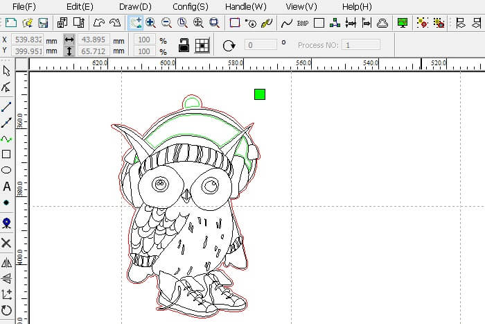
How does laser cutting artwork look?
The red lines in the owl image below are for cut through, the green lines are internal cut out details, and the black lines are for vector engraving.
Duplicate lines
Watch out for duplicate lines in your design. The laser will cut every line you make, whether you see it or not. Cutting and pasting creates lots of unwanted lines that you can’t see if they’re superimposed. You want one single line for each cut otherwise the material will be cut as many times as there are lines! This will increase production time and reduce product quality due to charring or melting on the reverse side. It might even cause a fire if the material ignites!
How much detail can I have?
The more complex the design, the longer it will take to cut and the more the job will cost. Bear in mind the size of the item, the material you’ve chosen and how robust the final product needs to be. As a rule of thumb, I recommend having 2 – 3mm spaces minimum between cut out areas to keep the design robust.
How about text?
Fonts like Times New Roman might be best avoided for small designs or as fine detail within large designs. Serif fonts have extended top and bottoms of the letters that can weaken the product if they are too close to each other. I avoid them unless the design is big and bold enough to allow 2 to 3mm spaces between cut out areas. Sans serif fonts like Arial don’t have this problem. I avoid cutting text smaller than 22 point, but this can vary for different fonts.
You should bear in mind that centres of a, b, d,e, g etc will fall out. To prevent this, you may want to select a stencil font as Old School Fabrications did for the plywood stencils in the picture.
Design size
You should design the artwork at the size you want to keep things simple. Vector artwork is rescaled easily without loss of quality. This is really useful as the same artwork can be resized and used for different applications.
Top tip
If you have a wireframe view function in your design software, this lets you see how the laser views the cutting lines.
Need more help?
If you need clarification on any point for your particular project, contact us and we can chat things through.